Survey comment
“Needs better mobile experience”
Implied issue
Poor use of space across screen sizes

TL;DR
Through user feedback, workflow analysis, benchmarking, and a detailed product audit, I found that the main problem was not missing features. It was hierarchy, focus, and context.
The redesign therefore started by redefining what mattered most at each point in the workflow.
Overview
I worked across the dashboard redesign, from research and workflow mapping to information architecture and the final client- and designer-facing experience. The focus was to make project progress easier to understand, give active collaboration more space, and reduce the amount of information competing for attention at once.
Solution
The Problem
They need to know what is moving, what needs attention, what is blocked, where feedback is required and who is working on what. But the current dashboard made this harder than it needed to be.
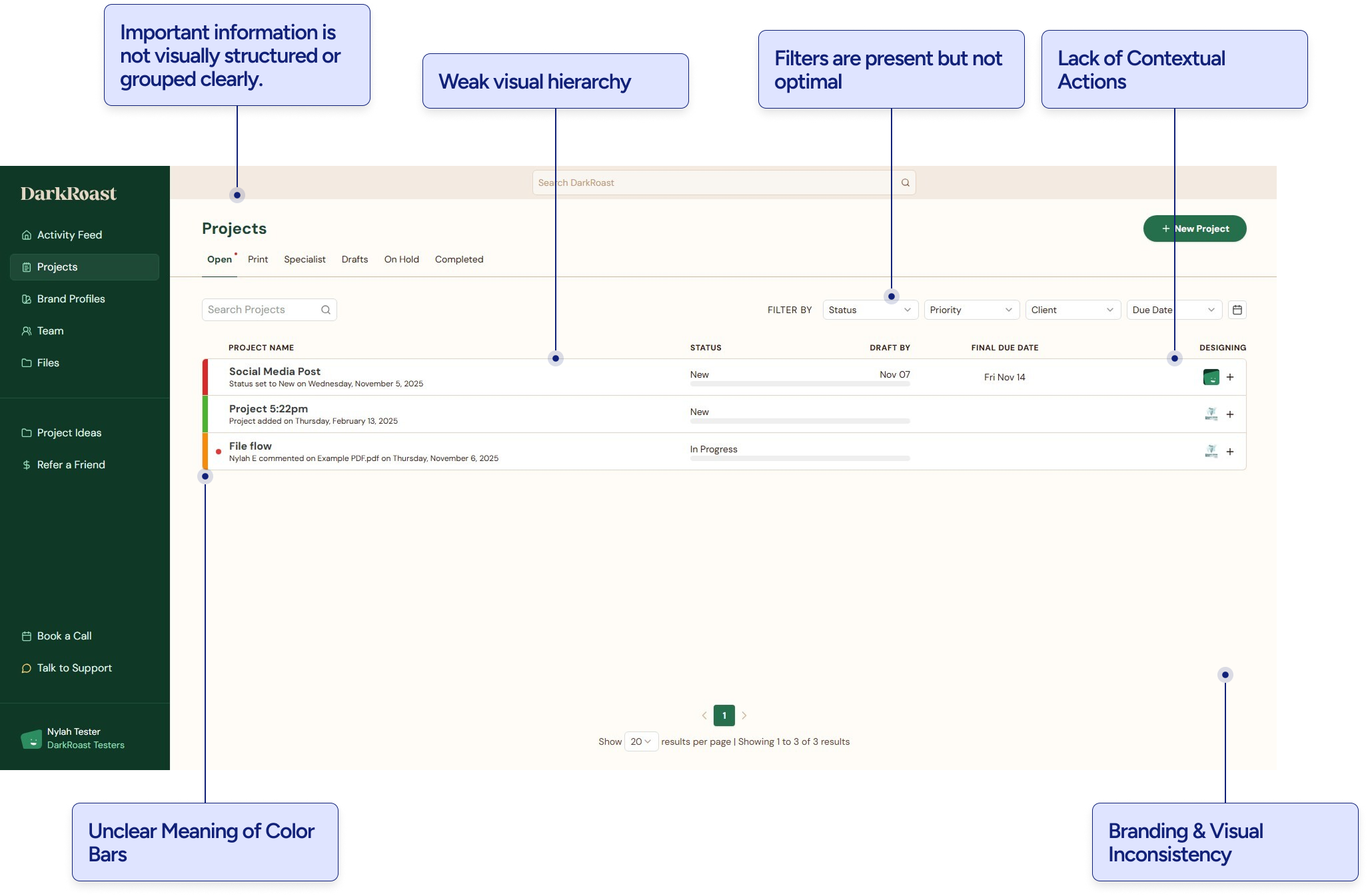
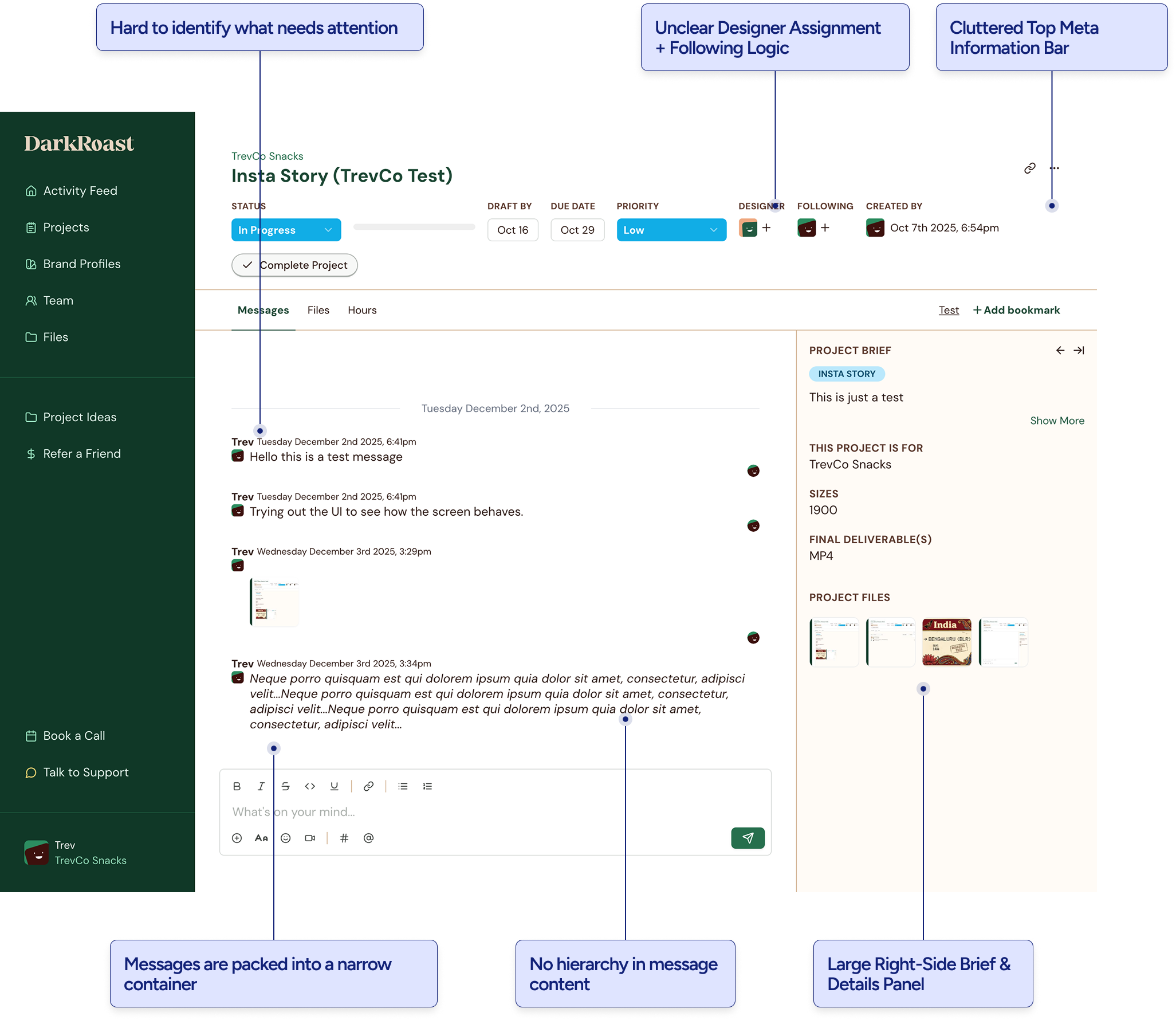
Across the dashboard, the issues were closely related.
Users had too much information visible at once but not enough clarity about what mattered now.
This resulted in:
The problem was not a collection of isolated UI issues. It was an information hierarchy and workflow problem.
Research
We started with the client feedback that already existed.
“Needs better mobile experience”
Poor use of space across screen sizes
“Needs better file management”
Previewing and finding the right file inside long conversations
“Issues with text, links and spacing”
Less reliability due to decreased trust
“Providing small updates felt too formal”
Product had a heavy management workflow
DarkRoast needed to support both structured project management and casual collaboration.
Mapping the client workflow
So I mapped the recurring jobs clients were trying to complete across DarkRoast. This helped separate the underlying workflow from the current interface and gave us a clearer basis for deciding what the dashboard actually needed to support.
Share intent
Turn rough goals into clear creative direction.
Start work
Create new work quickly using existing context.
Track progress
See what needs attention without opening every project.
Review work
Check quality and direction at a glance.
Give feedback
Iterate without re-briefing or heavy process.
Reuse & scale
Carry past work and brand context into future projects.
Defining the product mental model
A project had two modes.
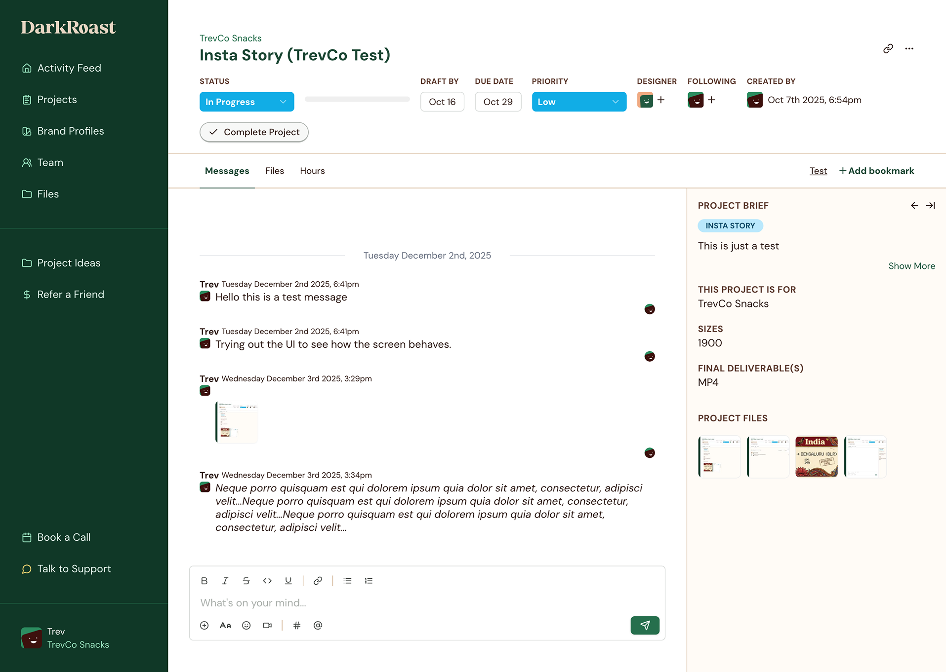
The existing product treated both modes as equally important all the time. That was creating unnecessary density.
Our working principle became: Give active work priority. Keep reference information close, but not permanently in the way.
By the end of the research and audit phase, three priorities were clear.
Make progress obvious
Clients should understand what is happening across their projects without opening each one.
Give active work more space
Messaging, feedback, and collaboration should take priority when users are working inside a project.
Reduce persistent information
Reference content should stay accessible without competing with the main task.
These principles became the foundation for the next phase.
Iterating on the project listing
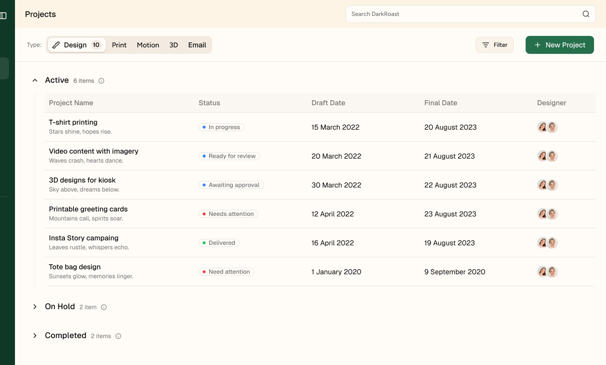
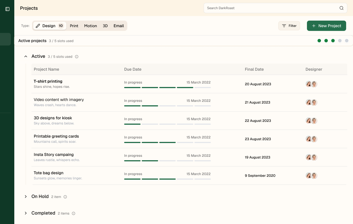
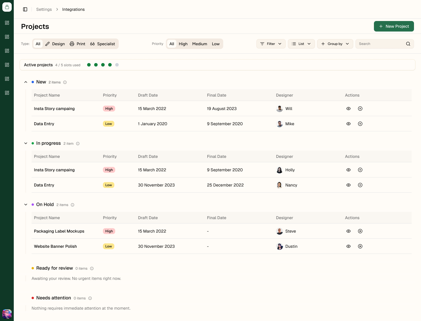
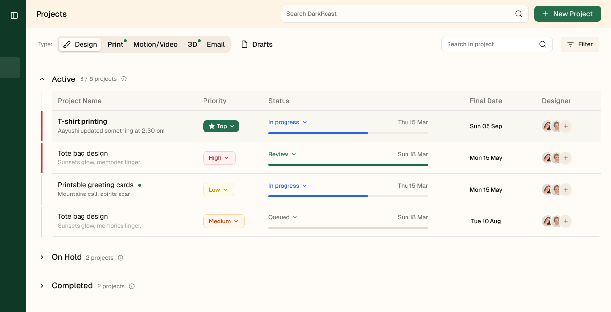
I explored several directions around grouping, status visibility, priority, progress, and project capacity. Each iteration tested a different balance between density and visibility, helping us narrow down which signals needed to stay prominent and which could be reduced.
Iterating on the project detail header
I explored a few ways to simplify the header by reducing metadata, improving the placement of project actions, and keeping important context like status, designers, search, and project details easy to access.
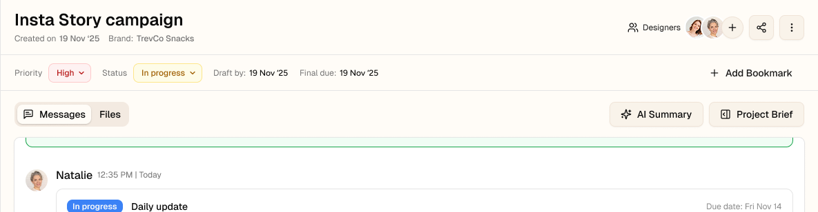
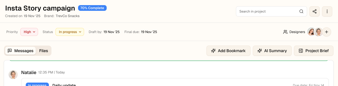
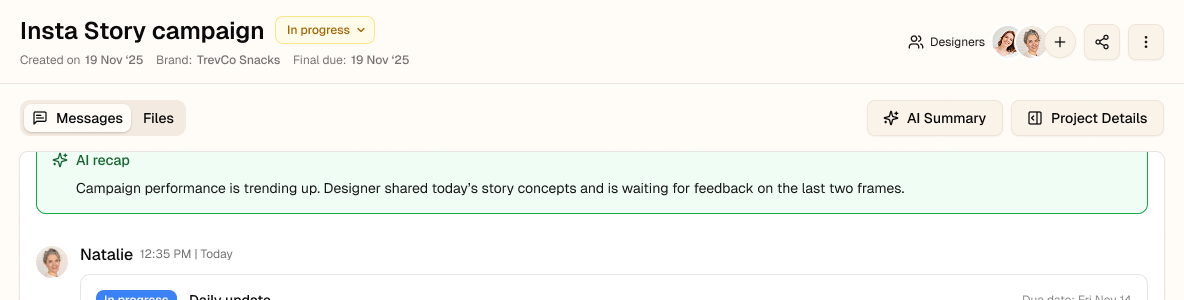
Across the iterations, the direction became clearer:
Final design
The final redesign focused on a few high-impact changes rather than replacing the whole experience. Each change came directly from the research and audit, with the goal of making project status easier to scan, active work easier to focus on, and secondary information easier to access only when needed.
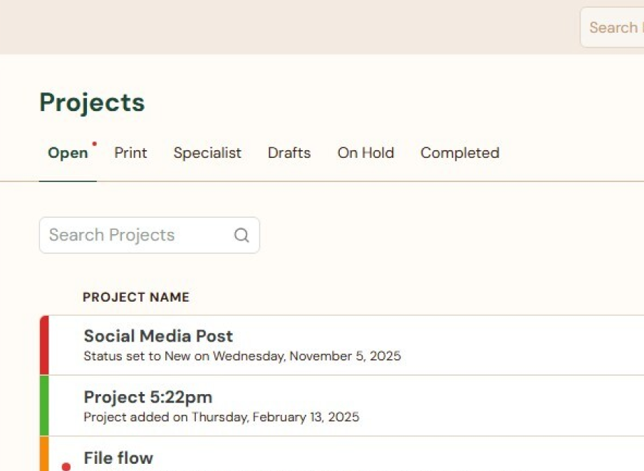
Before
Project types and statuses were mixed into the same navigation, making the page harder to scan. Clients had to work harder to understand what kind of work they were looking at and what needed attention.
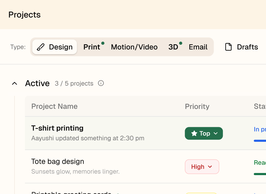
After
Project type, status, and priority were separated into clearer layers with stronger visual signals. This made the list easier to scan and helped clients understand project context without opening each item.
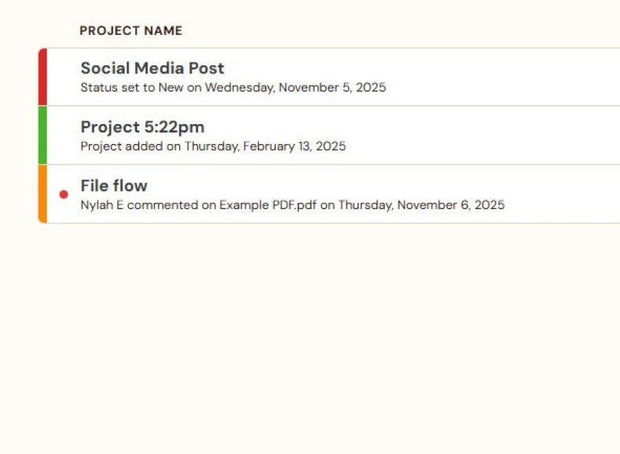
Before
Project rows relied on ambiguous color bars and activity text to signal what was happening. Clients had to interpret those cues before they could understand priority, status, or what needed attention.
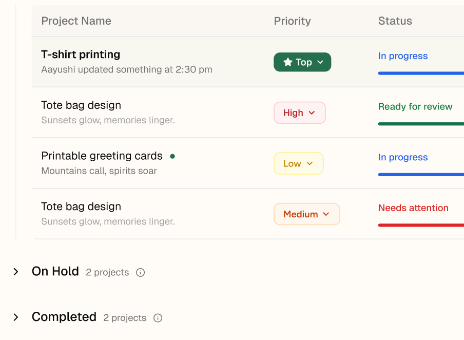
After
Priority and status became explicit, scannable fields with clear labels and stronger hierarchy. This made urgent work easier to spot and reduced the need to open projects just to understand their state.
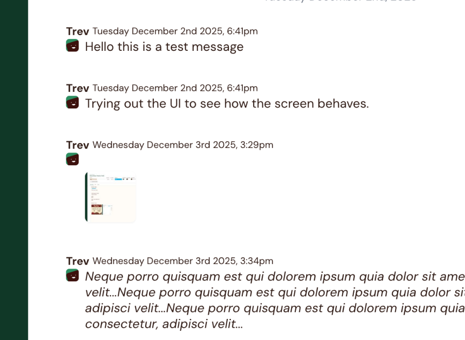
Before
Messages appeared as a flat stream, with weak separation between people, dates, text, and shared files. This made longer conversations harder to scan and reduced confidence about what was new or important.
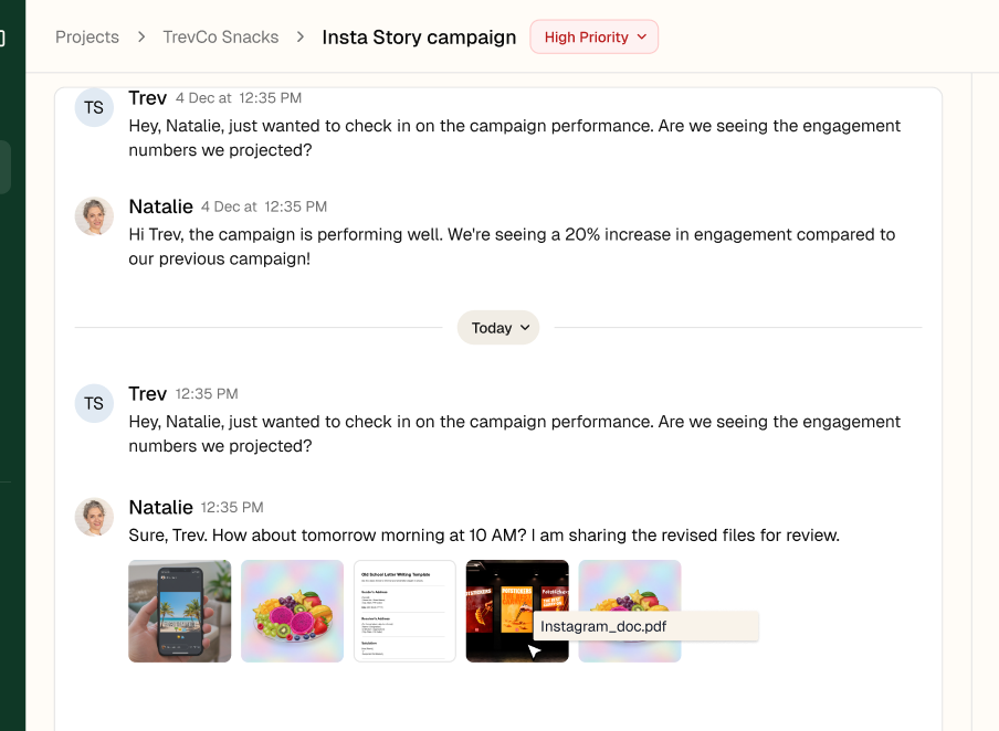
After
The conversation was restructured with clearer message grouping, stronger sender hierarchy, date breaks, and files shown in context. This made the thread easier to follow and helped clients review updates without losing the surrounding conversation.
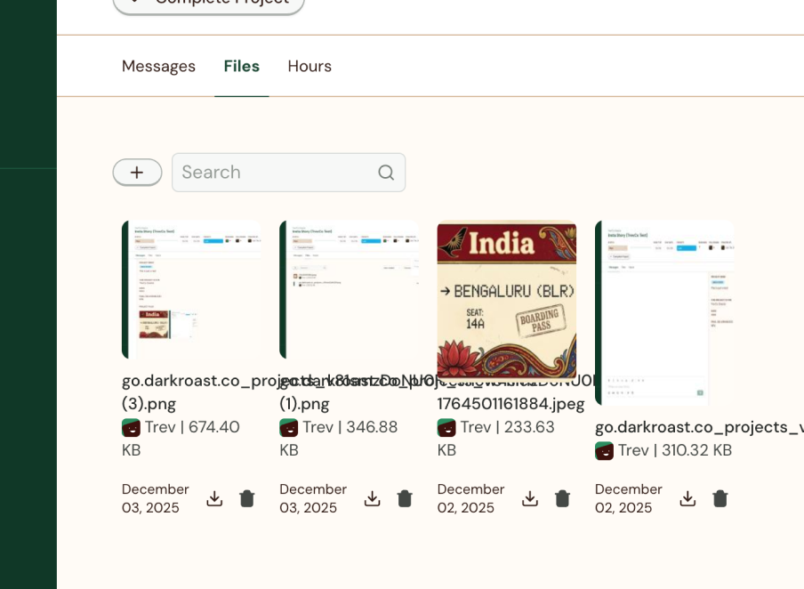
Before
Files were shown as a flat list with small previews and very little review context. This made it harder to understand versions, compare assets, and give feedback without switching back and forth.
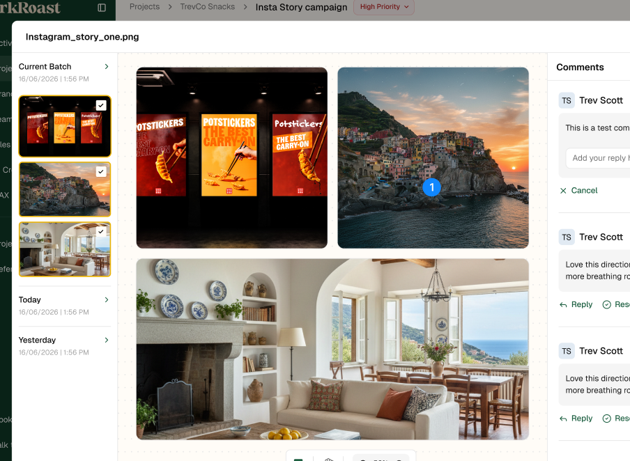
After
File review was expanded into a dedicated workspace with larger previews, grouped versions, and comments alongside the asset. This made review more focused and helped clients assess creative work and respond in context.
Outcome
The final direction made project status easier to scan, gave collaboration more space, and brought files, feedback, and reference information closer to the work they supported.
Rather than adding more features, the focus stayed on reducing friction, improving hierarchy, and making progress easier to understand.
This project pushed me to think beyond individual screens and focus more on workflow, information architecture, and product behaviour.
The biggest lesson was that the right solution was not a complete redesign. It was understanding what users needed to notice, what they needed to act on, and what could stay one step away.
From audit to final interface, the goal stayed the same: make creative work easier to follow without making clients manage the process.